Rebranding two agencies into one family


DotControl &
RockBoost
Art Direction - DotControl
Lead branding & execution - Me
Lead branding & execution - Me
Brief
Rebrand two visually very distant-looking agencies into one family.
New brand values
Funky, Driven, Powerful & Mischievous
Date
September, 2020
Rebrand two visually very distant-looking agencies into one family.
New brand values
Funky, Driven, Powerful & Mischievous
Date
September, 2020
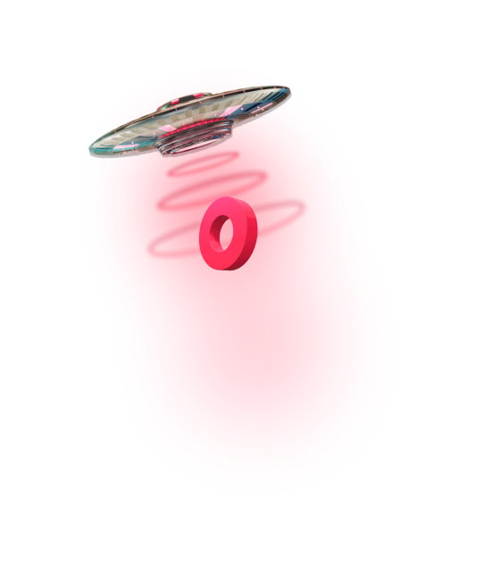
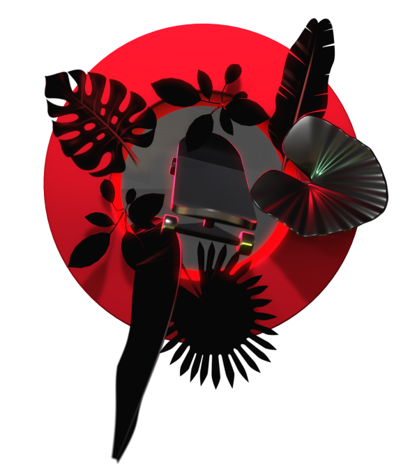


Visuals created for the DotControl's & RockBoosts Playbook.

Rebranding means a fresh start. A fresh breath, time for reflection & strategic moves. While working at Dotcontrol I was the main responsible for the visual style and the story of the two brands, now visually united into one family. Some things needed more funk, others more visual power, third were very unclear in the first place.
One of the most asked questions? "What color pink are we actually using?" It's different every time one spots it. So more clarity on the new brand guidelines? Check! At the end, rebranding starts from within. If my colleagues can't embrace and carry the new story, is it even worth it? How do you explain the new branding in 5 minutes to anyone of your 70 colleagues, not matter how design savvy they are?
One of the most asked questions? "What color pink are we actually using?" It's different every time one spots it. So more clarity on the new brand guidelines? Check! At the end, rebranding starts from within. If my colleagues can't embrace and carry the new story, is it even worth it? How do you explain the new branding in 5 minutes to anyone of your 70 colleagues, not matter how design savvy they are?
Think balls, act brains...
What? Well.. the thinkers and the doers in a healthy mix. Meet the two new typefaces – Galano Grotesque a.k.a the Balls. Very geometric, all sharp but round, soft but bold. The doer. The balls. The perfect match with the two new logos. Paired with Newzald, the witty sheriff in charge of authority and explaining more in depth. Okay... but how about the issue with the colors mentioned before? Those were narrowed down to matte black, white & the now legendary #FF2345. This shade of pink doesn't even need a name. It's the (inter)action color, counting up to remind you it's time for action.

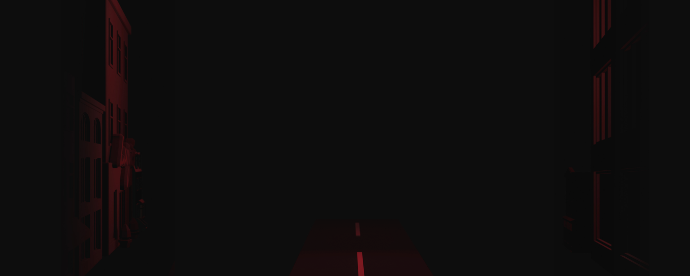
The first three case studies in the new identity. The case colors the scene, and brings freshness in the one-colored brand pallet of the brand

Another set of two visuals for the playbook. Left: The process, right: The teamwork needed for success

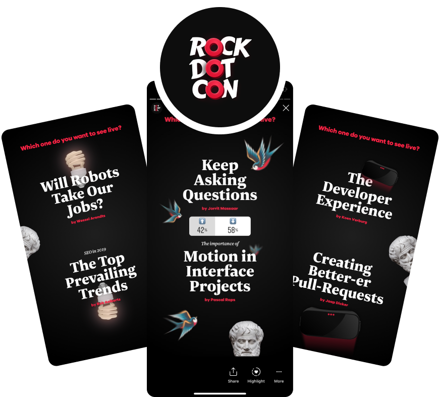
Some social media visuals for the conference. Those are for the live poll on what talk to livestream.

RockDotCon was the first ever external conference organised by the two companies. Around 50 people who came to see and hear talks about growth hacking, design and development. Since I was the only designer involved in the rebranding project of the two companies, I got the chance to design the branding for the conference as well.

The main hero of the conference. Aristotle, 24 centuries later.
Other related projects to explore:

A brand with a soul, for the future of all
Check it out
